Does your brand have a cohesive Instagram aesthetic?
Or does your Instagram profile look disjointed, unfocused, and — dare we say it? — off-puttingly cluttered?
As comedian Will Rogers (or maybe it was a real-life Don Draper or Peggy Olson) once put it, you never get a second chance to make a first impression. So, unless you want your Instagram profile to accidentally push prospects towards your competitors’ checkouts, you need to make sure it has a consistent look, feel, and tone.
Here are our top tips to help you build a cohesive Instagram aesthetic that makes your brand stand out and brings more customers to your virtual doorstep.

Manage all your social media accounts in one place.
Craft, schedule, & auto-post content to all your social channels, then track analytics and manage interactions from a single, easy-to-use dashboard.
Why is a cohesive Instagram aesthetic important for brands?
Well, because Instagram is a marketing and sales powerhouse.
In 2021, Instagram had 118.9 million users just in the States. One in two people used it to discover new brands, products, or services. And 44% shopped on it at least once a week.
Clearly, if you’re not doing Instagram right, you’re missing out on a huge business opportunity. And because Instagram is, first and foremost, a visual platform, a fundamental part of ‘doing it right’ is having a cohesive aesthetic.
If your Instagram profile and posts have a consistent look, feel, and tone, it’ll be easier for users to recognize and remember your brand. Over time, this familiarity will make them more likely to trust you and buy from you.
![]()

Source: Statista
But a cohesive Instagram aesthetic makes things easier for your social media team, too.
If everyone is on the same page about how your Instagram profile should look and feel, your team can save time by creating templates, automating repetitive tasks, and standardizing other aspects of managing your page.
Creating an eye-catching Instagram aesthetic: 4 steps to success
Creating an Instagram aesthetic that accurately reflects your brand and connects with your ideal customers requires a strong vision and careful planning.
We’ve broken down the process into four steps.
Step 1: Define your brand
Before you even think of scheduling your first Instagram post, you need to have a good sense of your brand. How do you want your customers to perceive you? What do you stand for?
If you’ve been in business for a while, you may already have an idea of the answers. That said, it’s still worth taking time to reflect — you never know what new insights you might come up with.
There are many exercises you can do to define your brand. We’ll give you two of them:
-
Branding word association
Set a timer and spend 15 minutes writing down words you associate with your brand. For example, you could write ‘adventurous’, ‘fun’, and ‘cute’. Or you could go in the opposite direction and write words like ‘dependable’, ‘serious’, and ‘trustworthy’.
At this stage, there are no right or wrong answers, so don’t overthink it. Just write what comes to mind.
When you’re ready, you’ll need to narrow it down to just three words.
Take your time when doing this. For example, you could spend 10 minutes a day deciding which one word to cut from the list.
The last three words standing are your core values.
-
Celebrity ‘What if?’
If the idea of brainstorming a list of brand descriptors and spending weeks whittling it down feels overwhelming, this exercise can be a handy shortcut.
First, ask yourself: ‘If my brand were a celebrity, who would it be?’
Next, define what makes your chosen celebrity’s voice uniquely theirs.
If you want your brand to sound like Morgan Freeman, for instance, you probably want to come across as authoritative, trustworthy, and dependable.
By contrast, if you’re channeling Jennifer Lawrence, you probably want your brand to be perceived as down-to-earth.
The results of these exercises should inform the overall look and feel of your profile, including your tone of voice.
If you’re a fun, laid-back brand, for instance, you could use conversational language and the occasional emoji. Or you could write in a witty or irreverent tone, like drinks company Innocent does in its Instagram bio:

And in many of its text-based posts:

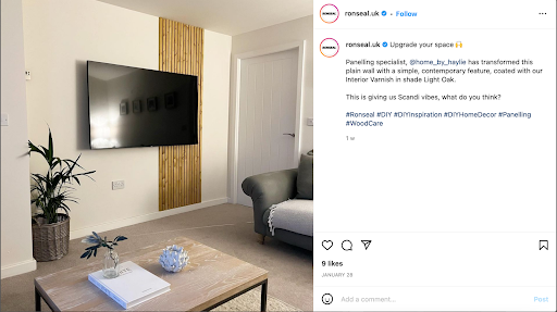
By contrast, if you want to come across as a safe, dependable brand, you could strike a more measured and helpful tone, like paint manufacturer Ronseal:

Step 2: Choose your colors wisely
Color is critically important to your Instagram aesthetic. In a study on the psychology of color, researchers found it increased brand recognition by 80% and influenced 85% of buyer decisions.
No pressure, then.
Needless to say, your color choices should reflect your brand values and complement your tone of voice.
If you’re a fun, playful brand, go for bright colors. Dark, heavy colors will look jarring if they’re paired with a light-hearted tone.
By contrast, if you want to come across as the safe, sensible choice, neutrals or earth tones will probably work best. Avoid loud colors and gaudy patterns.
If you’re not sure where to start, a mood board can be a good jumping-off point.
Pick images that feel relevant to your brand, and make a note of the colors and themes they have in common. If you sell office supplies, for instance, you may notice that many of your chosen images feature greys, whites, and browns.
You could also pick your color palette using a color wheel or a tool like My Insta Palette. Just remember to follow these best practices:
-
Stick to one primary color
Customers will start associating your primary color with your brand, which will make you more memorable.
This is especially important in Instagram stories because users tend to flip quickly from one story to another. People should be able to tell it’s your brand without having to check out your profile.
-
Use accent colors to draw users’ eyes towards things you want to highlight
This could be your pricing, a post about a new feature you’ve launched, or even a limited-time offer.
Bank of America‘s primary color, for instance, is blue. So using a bold shade of red makes this post about a cashback deal much more eye-catching:

-
Leave plenty of negative space
This draws the eye to the main subject of a post and gives your feed room to breathe, so it doesn’t feel cluttered
-
Make sure your chosen palette mirrors that on your website and other social media accounts
If your Instagram feed’s color palette differs significantly from the one on your website and other social media accounts, it may confuse your customers and make it harder for them to recognize and trust your brand
-
Test before you commit
With Loomly’s post preview, you can see exactly what a post will look like before you schedule it, so you can apply filters and make other tweaks until it’s just right
Step 3: Plan your posts
Now that you’ve nailed your brand values and color palette, it’s time for the fun part: planning your feed.
A good social media management tool can make idea generation and collaboration easier. Loomly, for instance, shows you relevant post ideas based on trending topics, holidays, or RSS feeds, and makes it easy to share drafts for comment, approval, and scheduling.
But the way your Instagram profile will look as a whole is just as important as the content of individual posts.
With Loomly’s grid preview tool, you can see which posts would look best next to each other so you can schedule accordingly. If there’s too much of your primary color on your Instagram grid, for instance, you could schedule a text-based post with a more muted background — or a post with a different color — to break things up.
You could also plan several posts that visually tie together. Luxury watchmaker Patek Philippe does this, and the overall effect reinforces the values of precision and outstanding attention to detail that the brand is famous for:

Of course, don’t forget to track your posts’ performance. Over time, you may find that some types of content do better than others. Monitoring will help you optimize your posting strategy so you can keep improving your results.
Just make sure you choose valuable metrics like engagement and click-through rates rather than vanity metrics like likes and follows. If you use Loomly, you get access to advanced analytics, including reach, impressions, and engagement rate, as well as click counts and where they’re coming from.
Step 4: Create a style guide
A style guide is useful for two reasons.
First, it’s something you can refer back to when you’re creating Instagram content to make sure you’re staying consistent.
Second, and more importantly, it makes it easier for you to delegate. Whoever posts on your behalf can refer to the style guide to make sure they get the aesthetic right and stay true to what your brand is about.
Because your style guide is a reference document, it should be as comprehensive as possible. At a minimum, it should include:
-
Information about your brand voice
How do you want to come across when you communicate? Are you fun, or perhaps a bit cheeky? Or do you want to strike a more serious tone?
Try to be as descriptive as you can. Include details about sentence length and structure, how you approach jargon, your stance on emoji use, and how you caption and format text.
The more detailed you are, the easier it’ll make it for your social media team to get it right.
-
Visual guidelines
This is where you set out how your Instagram profile should look:
-
- What’s your primary color?
- Which accent colors do you use and when?
- Which color combinations are acceptable?
- Which logos, icons, and photos do you use and when? For example, you might have a specific icon or photo which you use when you post a weekly tip. Loomly lets you store all your icons, photos, videos, and other visuals in one place
-
Hashtags
Hashtags can boost your Instagram content’s reach by 11%. But you need to use the right ones. Make sure your team knows which hashtags — and how many — to include by putting them into your style guide.
-
Handling interactions
How do you deal with customer queries and complaints? Do you direct them to a complaints-handling department? Or do you reply to common queries directly on your page?
If you do the latter, it’s worth adding an FAQ section to your style guide so your social media team can give consistent, reliable information. There’s nothing worse than a company saying one thing today and something completely different a week from now.
It goes without saying, but you should review your style guide regularly to make sure it continues to reflect your brand. And do leave your team some leeway to experiment (within reason). It could lead to some unexpected results.
Creating a standout Instagram aesthetic, in a nutshell
Whether you know it or not, your choice of colors, the language you use, and the overall look and feel of your Instagram profile say a lot about who you are as a brand.
A cohesive, intentional aesthetic will help you make sure you’re sending the right message, build more trust, and win more customers.


