Facebook has developed one of the most powerful advertising platforms in the world, which now captures more than 20% of digital ad spending (in the US).
Through advanced targeting, reach and measurement solutions, the possibilities of advertising on Facebook are virtually limitless — which can be intimidating at times.
In this article, we are offering you a shot of Facebook Ads Inspiration — including creative ideas for Instagram Ads & Stories Ads — to play with the specifics of each ad format and take your campaigns to the next level.
Let’s jump in!
1. Facebook Photo Ads
Facebook Photo Ads are the simplest and quickest ads you can create on Facebook and remain incredibly effective to drive traffic to your web properties outside of Facebook, like a landing on your website.
Many online resources — including some from Facebook themselves — offer guidelines to optimize photo ads, such as:
- Picking the right campaign objectives, relatively to your business goals.
- Choosing the right ad placements, relatively to your campaign objectives.
- Micro-targeting your ads — and customizing messaging accordingly — for atomic audiences (per city, occupation, employer, age group, interest, etc.)
- Maintaining branding consistency between the ad and the page to which the ad redirects.
- Keeping text in images to a minimum — Facebook states that images with less than 20% text perform better.
- Showing your actual product and/or actual persons using your product.
- Adding social proof, either to your creatives or your copy, in the form of number of users/customers, satisfaction survey results, positive reviews, testimonials.
- Using clear calls to action, as part of your ad headline, description, text of image.
- Creating a sense of urgency to encourage users to respond to your CTAs.
- Playing around with different ad variations (image, format, copy, CTA) to identify the most effective combination.
All of the above are tried and true best practices upon which all experimented advertisers can agree.
That being said, if we had to only pick one guideline to create effective Facebook Photo Ads, it would be this: the quality of the creative itself can make or break a campaign.
So, what’s a high-quality image?
Of course, the higher the resolution of the file, the better.
But the real attribute that makes a difference when it comes to ad performance is an image’s ability to stand out, and the keyword here, is: contrast.
Either contrast within the image itself, or contrast between the image and its surrounding context (i.e. the Facebook user interface).
In the Facebook Photo Ad below, you can see how the green background contrasts just as well with the surrounding of the image, as with the screenshots inside the image:
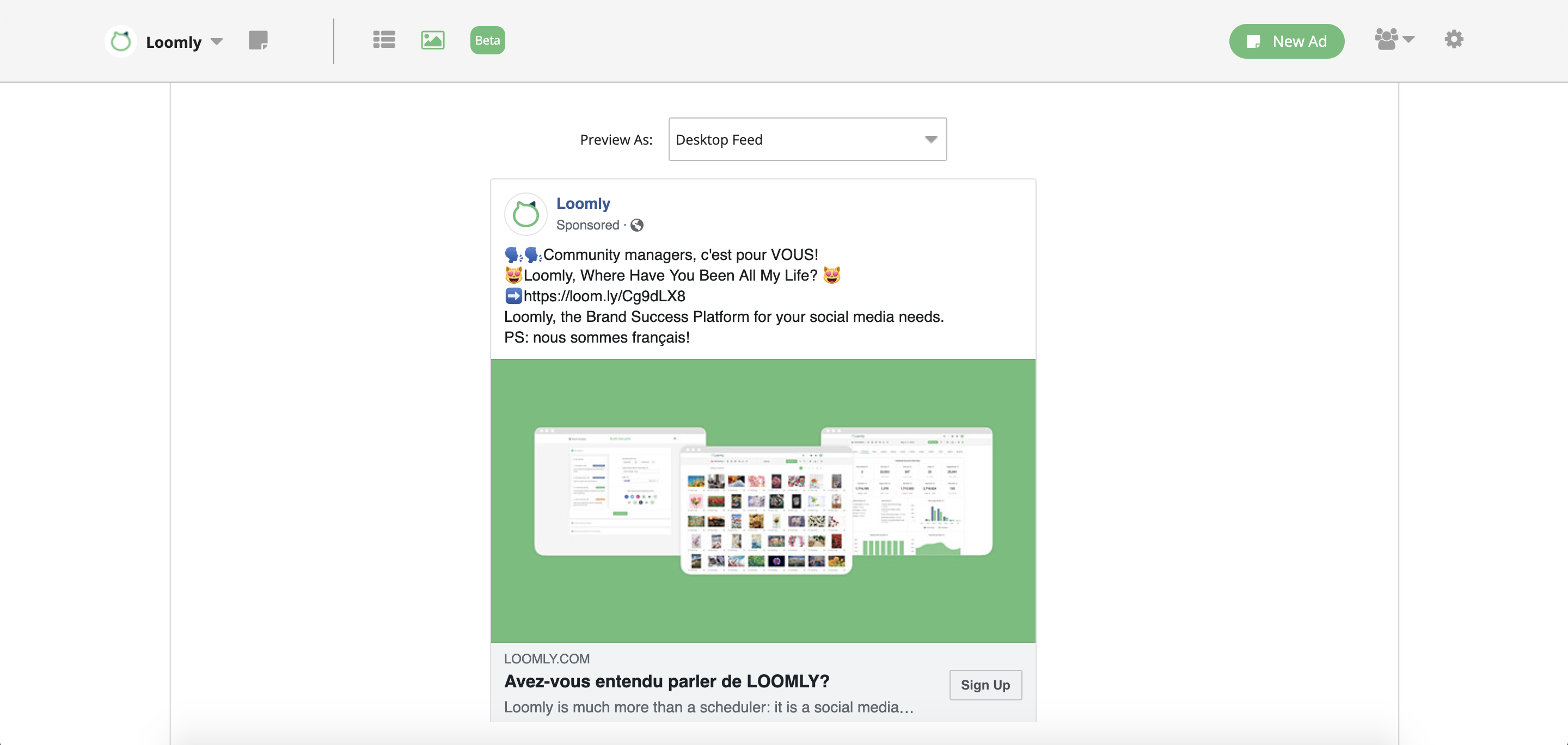
Note: this ad is in French, as it is targeting a French audience.
This leads us to the first creative hack of this list: combining two different assets with contrasting backgrounds into one file, separated by a border, make that Instagram Photo Ad look like it includes two different images.
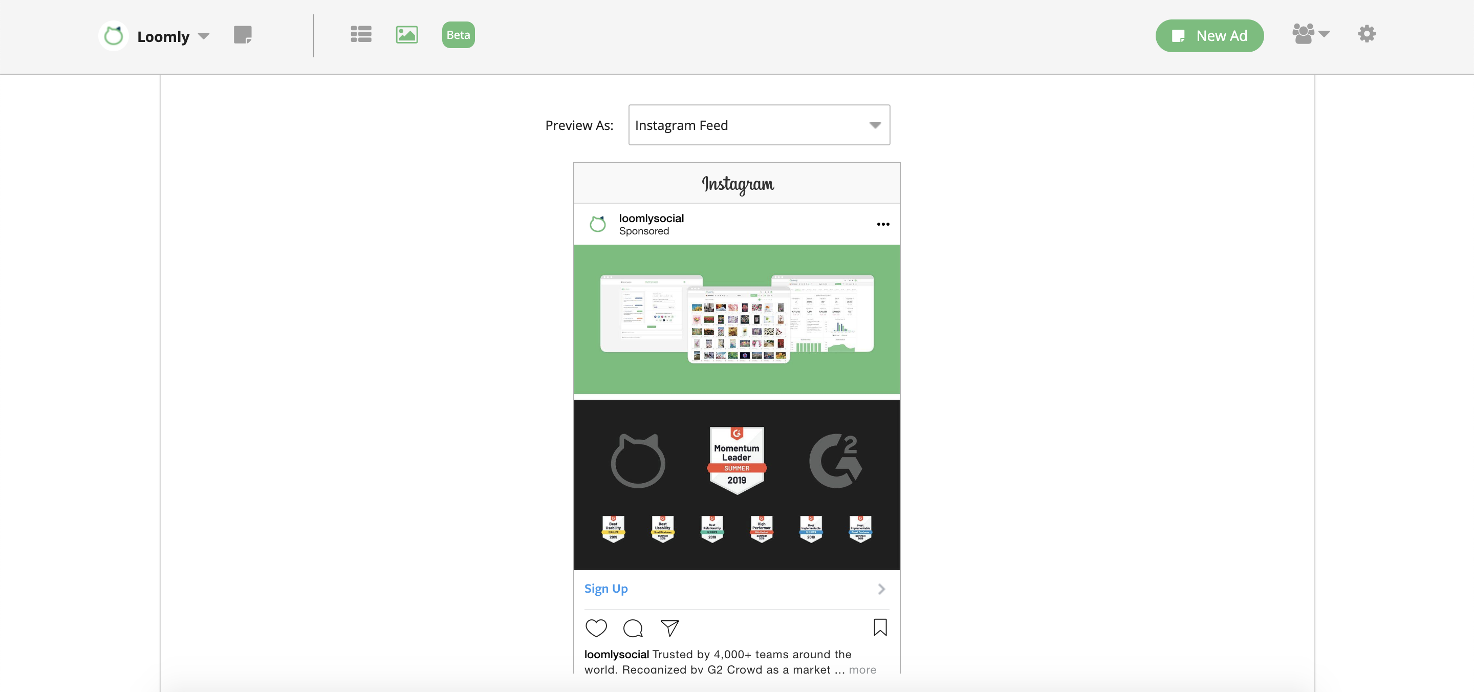
The reason why this is effective is because it challenges the user’s expectations, since most Instagram posts are formatted in the same way: one username, one image, one caption.
If you need high-contrast images to create splendid creatives, Unsplash is a great place to start; and if you need vectorized icons to liven the party, head to Flaticon.
2. Facebook Video Ads
Facebook Video Ads help your brand stand out in your audience’s feeds and drive both awareness and sales:
With people gazing 5x longer at video than at static content on Facebook and Instagram1, you can share the experience you offer, feature your product in action and deliver your message with video.
1Source: “Video in Mobile Feed” by Kantar Media (from Facebook IQ-commissioned research lab of 114 people ages 18-30 in AE and UK who watch short-form [under 10 minutes] online video [ads and non-ads] at least monthly), May 2016.
And you want to know the best part?
You do not even need a multi-million-dollar production budget to create and run video ad campaigns on Facebook & Instagram.
Here is what really matters:
- Picking an engaging thumbnail.
- Showing your branding right away.
- Grabbing the attention of the user in the first frame.
- Keeping things short (Facebook recommend 5-to-15-seconds video ads)…
- … and dynamic (think jump cuts rather than long takes).
- Taking up as much screen real estate as possible, with a square or vertical format.
- Making sure your video ads can be consumed with the sound off.
- Using captions as an additional branding support.
- Optimizing your video ads titles and descriptions.
- Including a clear call to action in the second half of your creative.
Guess what!
You can accomplish all of the above simply by creating videos from still images, either with:
- A free creative mobile app such as Quick by GoPro
- Adobe Spark Video Maker.
- Or even directly from Loomly’s library!
Here is a video created from static assets:

We used that video in ads when Loomly 3.0 got featured on Product Hunt:
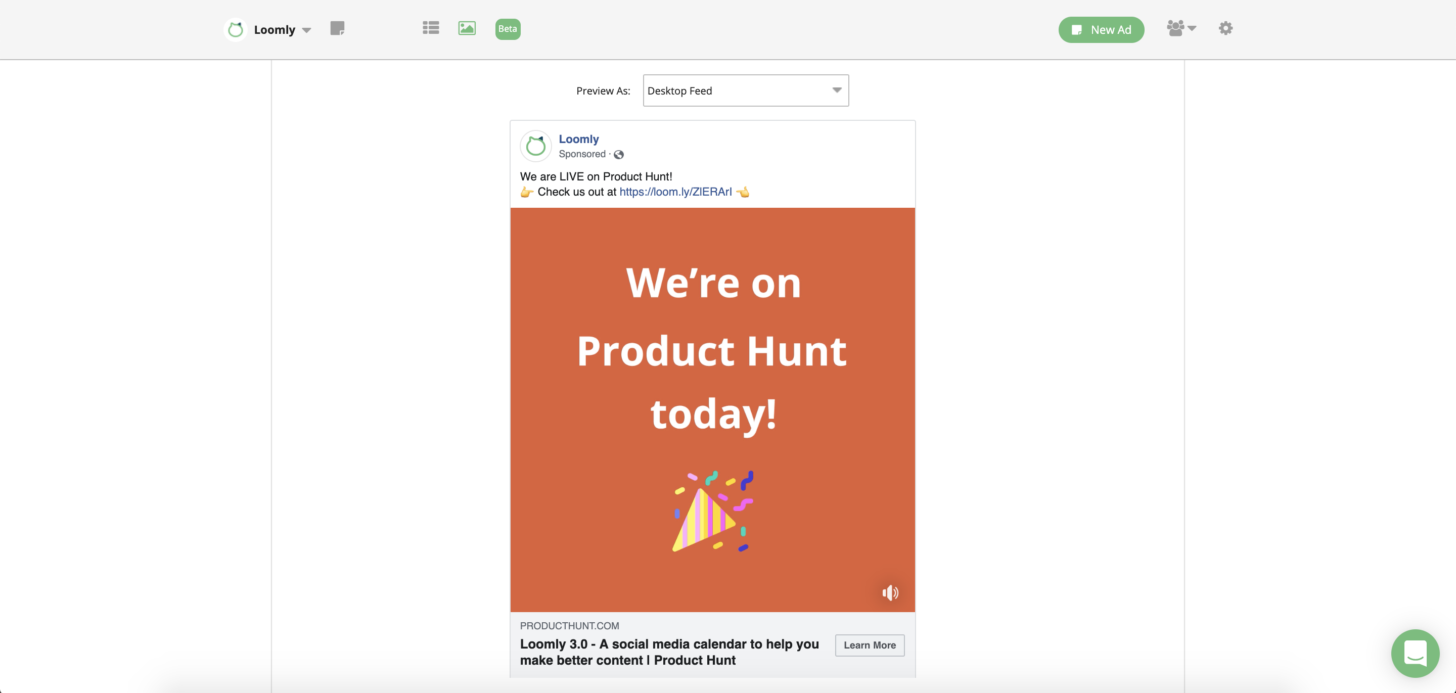
With this simple approach, you can harness the power of Facebook Videos Ads without breaking the bank.
3. Facebook Carousel Ads
Facebook Carousel Ads are great to tell a story that does not fit in a Photo Ad (when you want to promote more than one product) or in a video ad (when you need more room for your copy).
Carousel ads can be made from still images, from videos, or from a combination of both: see above for a list of simple ways to come up with nice photos and videos.
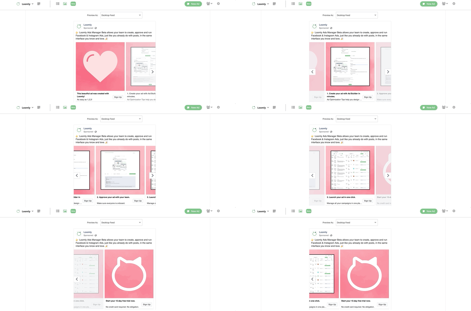
A sure-fire way of leveraging carousels is through visual consistency across all the slides of the ad.
For instance, in the following ad, you can see how the pink background creates a visual teaser that draws the user from one slide to the other:
 Building on this idea, a more advanced strategy consists of using the first slide as a hook that will peak the curiosity of the user, and then tell your brand story from there with the remaining slides.
In the example below, note how the image on the first slide has been uploaded upside down to stand out in the user’s feed, and then how the subsequent slides all look the same to invite the user to browse until the end of the ad, towards the CTA:
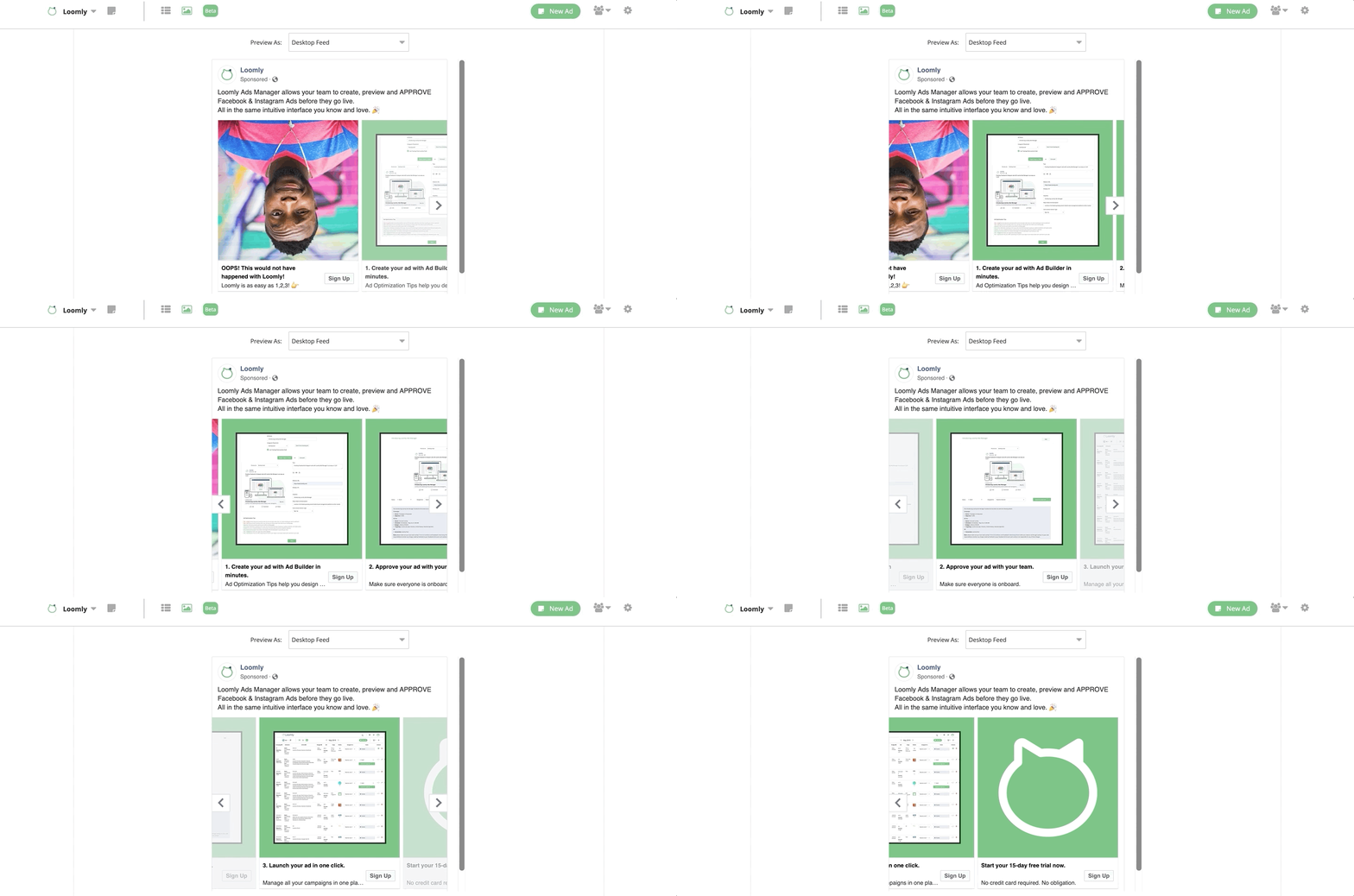
This is all the more catchy since the format of the carousel ad is used here to exemplify the benefit of the advertised product: Loomly Ads Manager allows marketing teams to preview and approve ads before they go live, to limit risks of typos, creative mistakes, etc.
Leveraging the ad format to highlight your messaging — rather than framing it — is an extremely powerful way of amplifying the power of your campaigns.
4. Instagram Carousel Ads
Instagram Carousel Ads are similar to Facebook Carousel Ads, except that they show up in the Instagram Feed — as one can reasonably expect — and look slightly different: only one slide is shown at a time and there are no vertical borders between slides.
These visual characteristics introduce new creative possibilities, such as turning contiguous slides into sequential parts of a panoramic image, which the user can discover by browsing through the carousel:
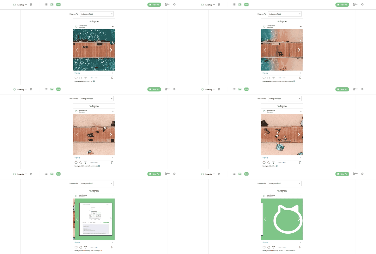
This does not only make the ad more fun and interactive: it creates a “wow” moment and enhances the impact of your brand in the eye and mind of the user.
5. Facebook & Instagram Stories Ads
Did you know that there are now more than 1 billion stories shared every day across the Facebook family of apps?
And it gets better:
In a workshop at F8 2019, we learnt that 1 in 2 people report they have visited a website — and 31% have gone to a store — to buy a product/service as a result of seeing it in stories.
We will soon publish a definitive guide to Stories & Stories Ads, but in the meantime, here are our best tips & tricks to create effective Stories Ads:
- Pick high-resolution assets, and produce pixel-perfect montages.
- Capitalize on quick, dynamic content to sustain users’ attention.
- Break down your narrative arc into scenes to keep users interested.
- Take advantage of the vertical format to offer an immersive user experience.
- Keep stickers to a minimum, to avoid visual noise and distraction around your message.
- Open and/or close with your brand to identify who is the author of the Story.
- Draw attention to CTA by clearly inviting the user to swipe up.
- Test, Learn, Rinse & Repeat until you figure out what make your audience tick.
Here are two Stories Ads examples designed according to the above principles:
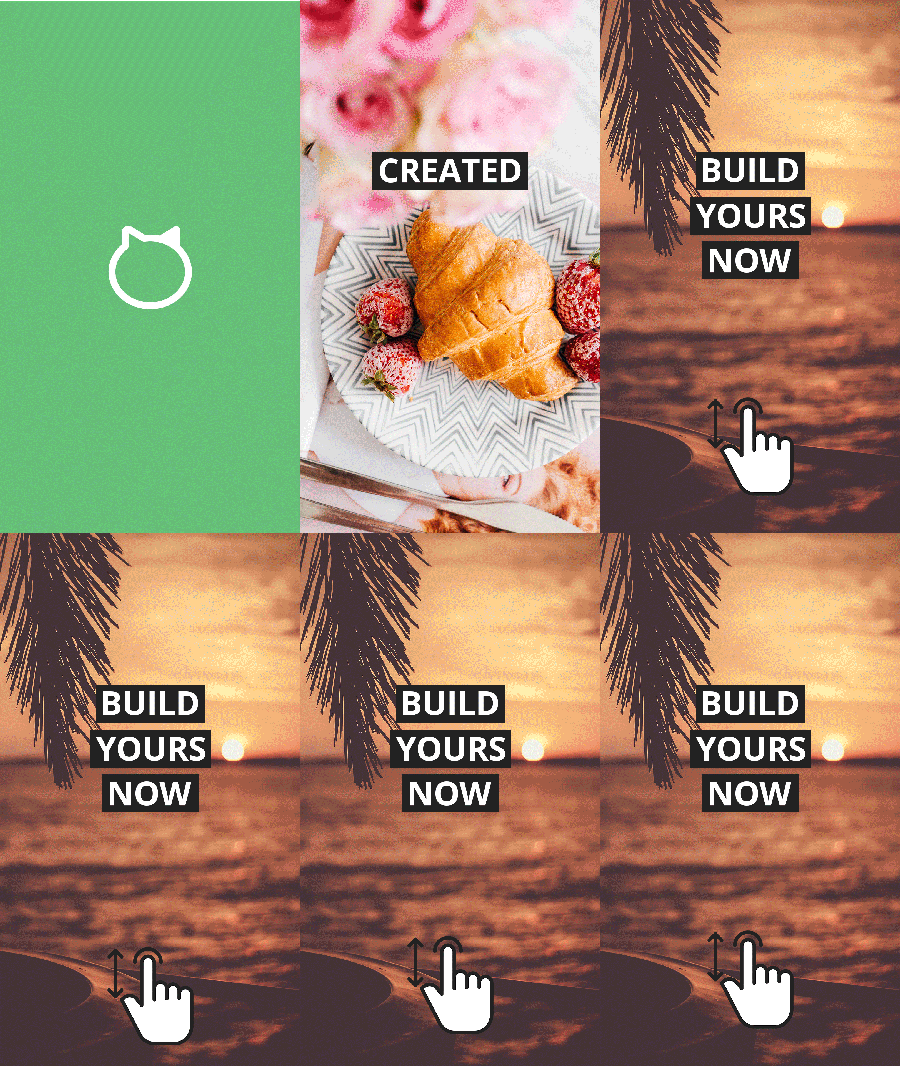
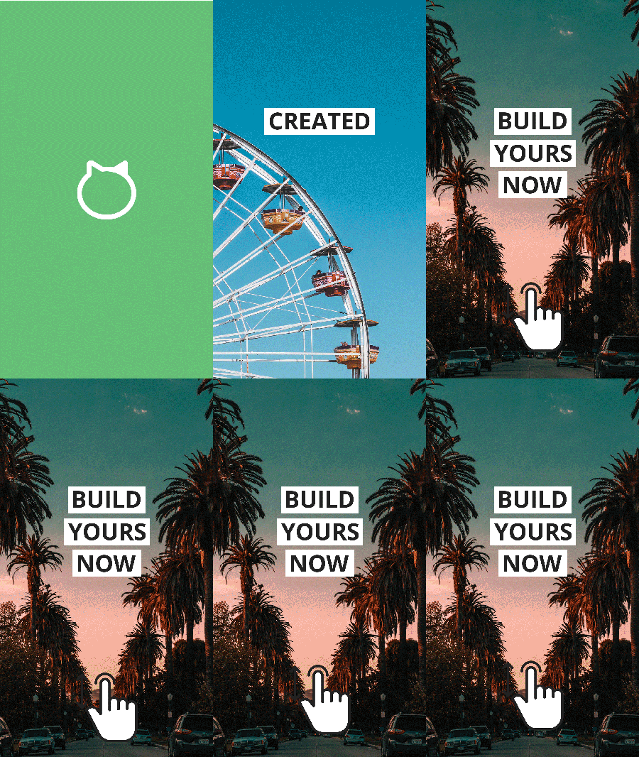
Note: we had to downgrade the quality of the visuals above to make the files lighter for this blog post. Original assets are high definition.
What To Do Next
If you are just getting started with Facebook & Instagram Ads, we hope this selection of creative hacks will help you nail it from Day 1.
If you are a seasoned advertiser, we trust this shot of Facebook Ads Inspiration will contribute to taking your campaigns to new heights.
In any case, keep in mind Facebook’s #1 recommendation:
Play with different images and formats before you commit to a particular ad, and always preview how your ad will look in the wild before you run it.
This is precisely what Loomly Ads Manager was designed for: to help you and your team create, preview & approve Facebook & Instagram Ads before you run them, so that you always launch the best possible version of every single campaign.
If you are already a Loomly user, login to your Dashboard and create a new Facebook Ad with Loomly Ads Manager.
If you haven’t tried Loomly yet, start your 15-day free trial now and take Loomly Ads Manager for a spin.
