YouTube has held its place as one of the most-used social media platforms for over a decade, with users of all generations tuning in for both entertainment and education. In fact, 57% of YouTube watchers use the platform as a search engine, just like they’d use Google.
That’s a lot of potential to capture interested and engaged traffic, both in search queries and casual scrolling. To snag that traffic and earn those clicks, however, you need to make sure that your video stands out. A strong video title and description can help, but your YouTube thumbnail is the crucial first touchpoint.
In this tips-based guide, we'll walk through the seven best practices that you should keep in mind when designing your next YouTube thumbnail.
YouTube thumbnail dimensions and specs
Before we dive into design strategies, let's cover the basics:
- Recommended size: 1920 × 1080 pixels (16:9 aspect ratio)
- Maximum file size: 2MB
- Accepted formats: JPG, GIF, or PNG
- Resolution: Keep it sharp — your thumbnail appears in multiple sizes across YouTube
You might see older YouTube guides suggesting a smaller 1280×720 pixels, but we recommend sizing your thumbnails at 1920 × 1080 pixels to account for all types of viewing experiences. Your thumbnail might show up larger than you expect, especially on TV screens and in YouTube's full-screen browse mode.
YouTube thumbnail best practices
From quick design wins to testing techniques, this is how to stay visually competitive in YouTube's increasingly crowded space.
1. Follow the .3 second rule
People decide whether to click or keep scrolling in just .3 seconds. But don’t think that means you need the flashiest thumbnail possible. Most importantly, you need a thumbnail they can actually compute that quickly.
Cluttered thumbnails with no immediate visual focus can be difficult for users to clock while scrolling — especially when they’re on their phone. With 70% of YouTube views happening on mobile devices, clean design is non-negotiable.
Focus on:
- Simple, uncluttered layouts
- High contrast between elements (like white text on dark backgrounds)
- Easy-to-read fonts at legible sizes (remember, 70% of views are mobile)
- Plenty of white space or breathing room around elements
2. Pick images and graphics carefully
When you’re creating a YouTube thumbnail, you’ve got You've got three basic ways to go:
- Quick and easy: Grab a frame from your video
- Middle ground: Take that frame and add some text magic
- Full custom: Design from scratch (worth it if you've got the resources)
Your pick depends on the resources you have available, but whether you’re using stills from your video or creating custom graphics, your thumbnail images should:
- Be visually compelling and capture attention within seconds
- Look crisp, clear, and unpixelated at all sizes (more people are watching YouTube on their TVs, which means bigger thumbnail dimensions)
- Show a clear correlation to the subject of the video
- Include faces when possible (they typically drive higher engagement)
If you’re going to grab a video still for your thumbnail, you’ll want to ensure there’s clear focus with no blur, no awkward mid-movement facial expressions. Look for frames that tell a story, show action, or offer something unexpected.
3. Show clear benefits
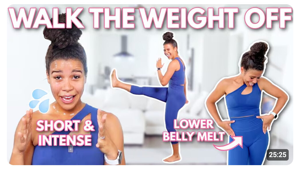
Are you more likely to click a video that says "20 minute workout" or one that says "Walk the weight off"? Every thumbnail should answer the viewer's question: "What's in it for me?" This means:
- Lead with the benefits, not just the subject line
- Use numbers when possible ("5 Tips," "15-Minute Guide")
- Show outcomes (before and afters or vs content)
- Add social proof if you have it
In the example above, there are three different benefits listed: walk the weight off, short and intense, and lower belly melt.
This thumbnail could just repeat the title, but by listing them out, it’s telling users how they can benefit if they implement what they learn in this video. These are big promises, and they may be more likely to click this compared to other videos that lead with the subject matter.
4. Play to their emotions
The best thumbnails tap into what your viewers are feeling right now — their frustrations, hopes, and dreams.
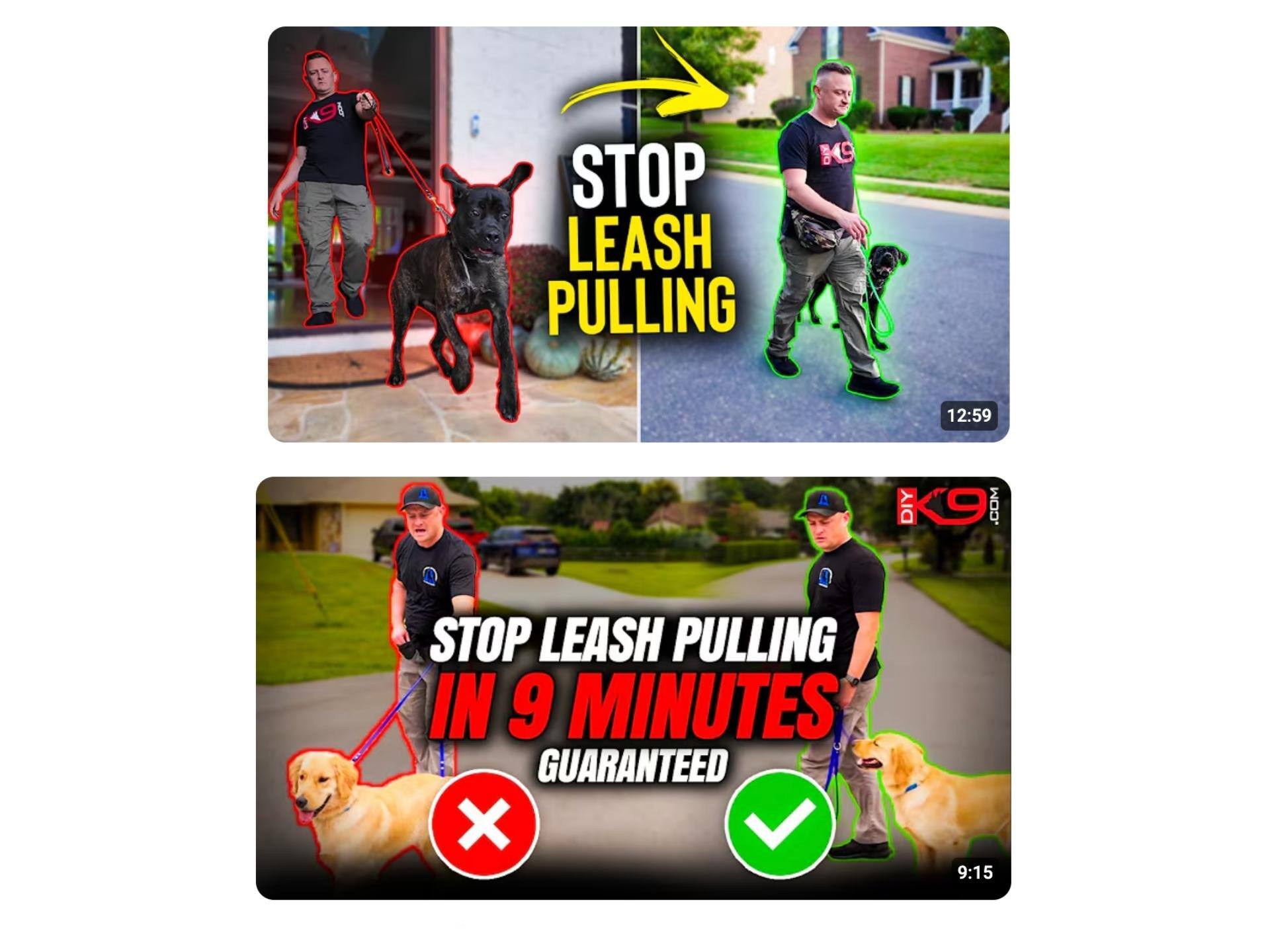
Look at these thumbnails for dog training videos:
It works because it shows the pain point (struggling with an unruly dog), the dream scenario (perfect walking behavior), and a clear promise ("15 minutes, guaranteed").
There are many storytelling devices you can use to connects with audiences’ emotions in your thumbnail, like:
- Before/after comparisons
- Problem/solution scenarios
- Posing a question
- Sharing a poignant quotation from the video
- Dramatic facial reactions and expressions
- Funny or meme-based content
5. Test and optimize your thumbnails
YouTube's analytics are among the best in social media, and their thumbnail A/B testing feature makes optimization easier than ever. Using this tool, you can test up to three different thumbnails on the same video to see which design elements resonate most with your audience.
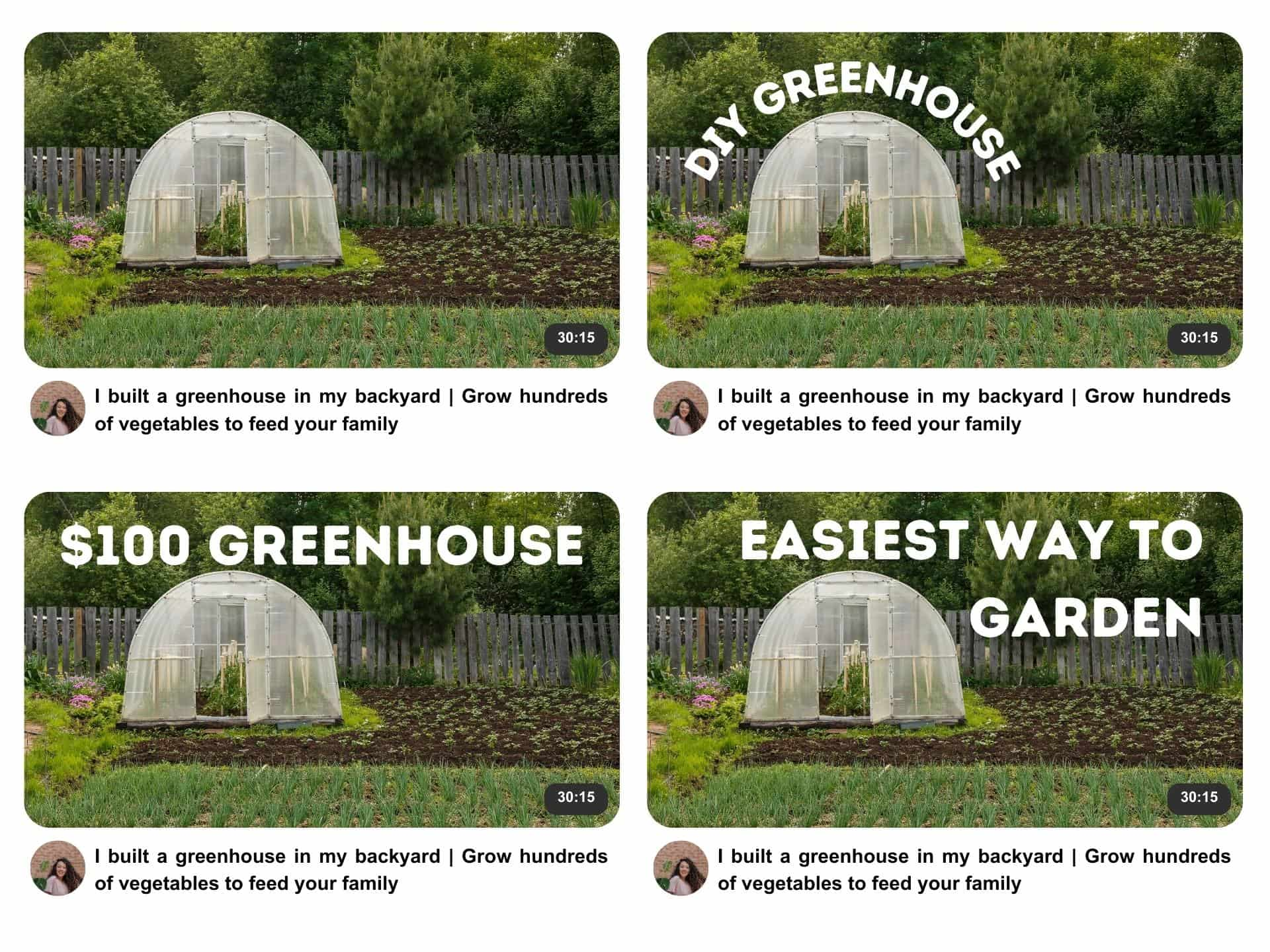
To run an effective test, be sure to change just one element at a time to get clear results. For instance, use the same image across all thumbnails but vary the text. This way, you'll know exactly which changes impact performance.
6. Make it recognizable
Your fans should know it's your video before they even read the title. Branded thumbnails incorporate consistent design elements that make your content instantly recognizable. This could be as simple as:
- Adding your logo in the same corner of each thumbnail
- Using consistent color schemes across your content
- Maintaining similar text placement and styling
- Creating distinct looks for different content series
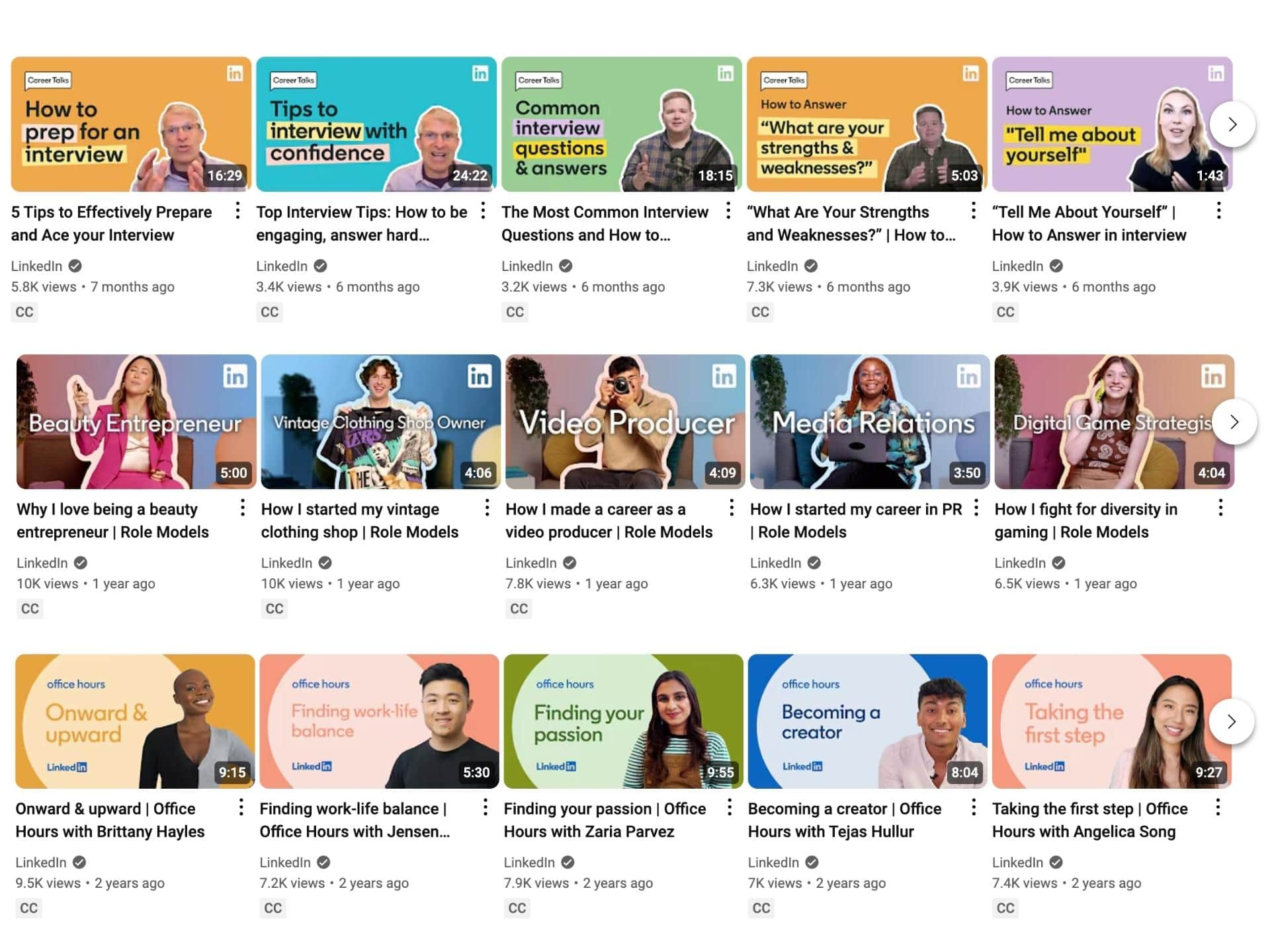
For example, LinkedIn uses different but consistently branded thumbnail styles for each of their content series:
7. Build your designs around a scalable framework
Most small and medium businesses don’t have the resources to hire a graphic designer for every YouTube video thumbnail, and they may not have the time to design fresh thumbnails from scratch every time.
That’s okay. You can make your life easier with reusable templates and other shortcuts like:
- Developing 2-3 core templates for different content types
- Using design tools with built-in templates, like Canva
- Creating a simple style guide for consistency
- Building a library of branded elements
- Establishing a repeatable production process
Keep testing, keep optimizing
While autoplay video dominates platforms like TikTok and Instagram, YouTube remains unique: it's still primarily a thumbnail browsing experience. The algorithm might get your video in front of viewers, but your thumbnail is what makes them click.
If you're just starting out with YouTube videos, don't overthink it. Start with clean, readable designs, test what works for your audience, and build your branded style over time.
If you’ve been on YouTube for a while, remember that thumbnails aren't set in stone. Got a great video that never took off? Try a new thumbnail, or use A/B testing to experiment with different approaches. Updating thumbnails is one of the easiest ways to breathe new life into your content catalog and attract fresh viewers while applying everything you've learned about what your audience responds to.
Want to learn more about YouTube marketing? Check out our full guide here!

