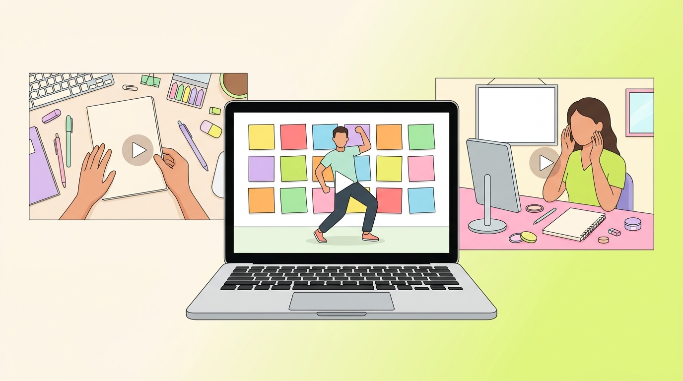
How to Create Better YouTube Thumbnails
A YouTube thumbnail is a promise made at a small size. It helps a viewer decide whether a video is relevant before they spend time on it. The best thumbnail is not the loudest image in a feed or a trick for forcing clicks. It makes the subject, benefit, or curiosity gap clear enough that the right viewer can choose confidently, then finds that the video delivers on the promise.
That makes thumbnail work part design, part editorial judgment, and part measurement. This guide covers the current upload requirements from YouTube, seven practical design habits, and the right way to evaluate a change after publishing.
Current YouTube thumbnail requirements
Start with a file YouTube can use well across its surfaces. According to YouTube's current custom-thumbnail guidance, use the largest practical image: YouTube recommends 3840 x 2160 pixels for videos and 2160 x 3840 pixels for Shorts. The minimum is 640 pixels wide for videos and 640 pixels high for Shorts. Upload JPG or PNG files.
- Standard videos: Use a 16:9 aspect ratio. A high-resolution 16:9 working canvas gives you room to crop and keeps the image clear in a large embedded player.
- Shorts: Use a 9:16 aspect ratio for an uploaded custom Shorts thumbnail. Custom Shorts thumbnails are currently added in YouTube Studio on a computer, and the channel must be verified to use the feature.
- File limits: Limits depend on where you upload. YouTube currently lists a 2 MB limit for video thumbnails uploaded on mobile and a 50 MB limit for video, Shorts, and podcast thumbnails uploaded on desktop. Check the current Help page if Studio rejects a file.
- Vertical videos: A 16:9 custom thumbnail on a vertical video can be replaced by an auto-generated 4:5 thumbnail on Home, Explore, and Subscriptions. The custom thumbnail can still appear on the watch feed, watch history, and non-mobile platforms.
To add or replace a video thumbnail, go to YouTube Studio, select Content, open the video, then use Thumbnail > Upload file and save. YouTube notes that changes can take time to appear. Custom thumbnails must also follow the Community Guidelines, and repeated policy violations can affect access to the feature.
Seven YouTube thumbnail best practices
1. Make the idea understandable at a small size
A thumbnail is often viewed in a crowded interface, so give it one job. Before you add type, effects, arrows, or a second image, ask: What should a person understand in one glance? The answer might be a result, a before-and-after contrast, a recognizable object, a question, or the presenter reacting to the central problem. It should not be the entire outline of the video.
Build a simple visual hierarchy:
- Choose one dominant subject: a face, product, screen, object, or result.
- Place the most important element where it can survive a small crop or a quick scroll.
- Use a background that supports the subject rather than competing with it.
- Add secondary details only if they clarify the promise.
Example: For a video titled How I organize a small desk, a clean image of the finished desk and one visible storage problem tells a clearer story than a collage of every organizer mentioned in the video. The title can carry the method; the thumbnail can show the outcome.
2. Use an image that genuinely belongs to the video
A thumbnail should accurately represent the topic, tone, and likely payoff. That does not require using a raw video frame. You can use a staged photo, a product image you have permission to use, a screen capture, an illustration, or a custom composition. The requirement is relevance: the viewer should not feel that the image promised a different video.
When selecting a frame from the video, pause on an image with a clear subject, a readable expression when a person is present, and no motion blur. When creating a custom image, avoid using a visual that makes a claim the video cannot substantiate. For a tutorial, show the tool, task, or finished state. For a review, show the item being reviewed. For an opinion video, show the person or issue at the center of the discussion.
Use only images, graphics, and branding that you have the right to use. A striking copyrighted photo that is unrelated to the video is a poor trade: it can mislead viewers and create rights problems at the same time.
3. Use text to sharpen the promise, not repeat the title
Text is optional. If the image already makes the idea clear, more words can make it worse. When text adds clarity, keep it short enough to read at a small size and use it to add a different piece of information from the title.
For example, a title might be My beginner guide to YouTube chapters. A thumbnail could show a video timeline with the words FIND THE GOOD PART. The title says what the video teaches; the thumbnail shows the viewer benefit. In contrast, repeating BEGINNER GUIDE TO YOUTUBE CHAPTERS on the image duplicates the title and creates a tiny block of copy.
Use a readable typeface, strong contrast, and enough space around the letters. Check the design at the approximate size it will appear on a phone. If the wording disappears, simplify it rather than adding more outlines, shadows, and effects.
4. Match the thumbnail, title, and opening
Strong packaging is a three-part agreement. The thumbnail earns attention, the title explains the promise, and the opening shows the viewer they made the right choice. If any part says something different, the viewer has to do the work of reconciling them.
Try this quick alignment check before publishing:
- Can the thumbnail communicate the subject without the title?
- Does the title make the benefit, question, or angle more specific?
- Does the first 30 seconds show the result, problem, or answer that the package led viewers to expect?
- Would a viewer who clicks feel accurately oriented, even if the video is not what they hoped for?
This is also the practical defense against clickbait. YouTube advises creators not to use titles or thumbnails that drive clicks while failing to satisfy viewers; a high click-through rate paired with low average view duration can signal a mismatch. Curiosity is useful when the video resolves it. Misleading drama is not a durable packaging strategy.
5. Create contrast and focus without visual noise
Contrast directs attention. It can come from light and dark, warm and cool colors, a clean border between foreground and background, scale, or a single unexpected element. Use it to make the main subject easy to find, not to turn every part of the image into a competing headline.
A practical approach is to start in grayscale. If the subject is still clear when color is removed, the composition has a good chance of working. Then add color to reinforce the hierarchy. Keep logos, badges, and episode numbers small unless they are genuinely the reason someone will click. A channel identity is useful when it helps viewers recognize a series; it is less useful when it hides the topic.
6. Build a recognizable system, not a rigid template
Consistency can reduce production time and help a recurring series feel connected. Build a small set of reusable decisions: a type style, two or three background treatments, a color palette, a safe area for a logo, and a method for handling screenshots or faces. Then allow the subject of each video to lead the composition.
For example, a finance channel might use one clear number, a real chart or object, and a consistent type treatment. A cooking channel might use a close crop of the finished dish and a restrained color treatment. The system makes production faster, while the subject keeps each video from looking interchangeable.
Create templates for repeatable formats, such as tutorials, interviews, product comparisons, and weekly updates. Save the editable source file, not just the exported PNG. That makes it easy to change a phrase, test an alternate crop, or update a thumbnail later without rebuilding the whole design.
7. Test a meaningful alternative and judge the right outcome
Do not guess forever when YouTube's native test can answer a real question. Eligible creators can use YouTube Studio on desktop to A/B test up to three titles, thumbnails, or title-and-thumbnail combinations. The tool requires advanced feature access and is not available for Shorts, scheduled live streams, Premiere videos, private videos, videos made for kids, or mature-audience content. Live archives can be tested, and a Premiere becomes eligible after it ends and converts to a long-form video.
Choose alternatives that express distinct hypotheses. For a productivity tutorial, test one thumbnail that shows the finished result against another that shows the frustrating starting point. For a review, test the product in use against a close detail of the feature named in the title. Avoid making all versions nearly identical; YouTube notes that similar options can make it harder to identify a winner.
The native tool selects the title or title-and-thumbnail combination with the highest watch time for viewers, not the highest click-through rate alone. A test can take a few days or up to two weeks, and some results will be Performed Same or Inconclusive rather than a clear winner. That is useful information: it means the difference did not produce a strong measured effect in that test. Keep the version you prefer, then test a more meaningful contrast next time.
How to measure a thumbnail after publishing
Use the Reach report for the specific video: Content > [video] > Analytics > Reach. Review the Impressions and how they led to watch time report alongside traffic sources, average view duration, and watch time. This avoids a common mistake: treating click-through rate as a verdict without knowing who saw the video or what they did after clicking.
Work through these diagnostic questions:
- Were there enough registered impressions to learn from? A thumbnail impression has a specific YouTube definition, so it is only a subset of all views and all places a video may be seen.
- Where did the impressions come from? Home, Search, Suggested videos, subscriptions, and external sources can bring different viewer intent. Compare like traffic sources where possible.
- Did click-through rate and average view duration tell the same story? A clear promise that the video fulfills is the goal. Do not change a thumbnail solely because of a small movement in click-through rate.
- What does audience retention say about the opening? If viewers click but leave early, revisit the package-to-opening agreement before making the thumbnail more dramatic.
- What will you test next? Write down one hypothesis, one alternative, and the metric combination you will review. This keeps optimization from becoming random redesign.
Example: A video called Three ways to fix a slow laptop receives impressions from YouTube Search and has a modest click-through rate, but viewers who arrive watch the first repair step and continue through the second. Instead of adding an exaggerated warning badge, test a thumbnail that shows the specific symptom named in the most common search term. The alternative is more relevant to the viewer's intent, and the retention data says the video itself is worth preserving.
A pre-publish thumbnail checklist
- Does the image accurately represent the video and its likely payoff?
- Is there one clear subject or idea at a small size?
- Is any text short, readable, and complementary to the title?
- Does the opening of the video quickly deliver the package's promise?
- Is the file the right aspect ratio, resolution, format, and size for the content type and upload device?
- Do you have the right to use every image, graphic, font, and logo?
- Does the thumbnail comply with YouTube's Community Guidelines?
- If you are testing, do the versions represent a meaningful difference?