Love ‘em or hate ‘em, presentations (aka slideshows, keynotes, powerpoints, decks) are a way of life in the business world. They have become the standard format for sharing information, whether it's showcasing your latest social campaign's ROI to your team or delivering a polished pitch deck to win over a potential client.
Creating engaging social media presentations is more important now than ever. With the rise of remote work, many presentations happen over video calls. Sometimes the video calls don’t even happen, and the presentation is simply a PDF attachment in a Slack or an email.
Without the full force of an in-person presentation, your slides must speak for themselves and stand on their own. We’ll show you how to get there in this guide. Here’s what we’ll cover:
- What is a social media presentation
- How to create a social media presentation
- Social media presentation examples
- How to crush your social media presentation
Let’s get started.
What is a social media presentation?
A presentation is simply a strategic visual communication tool. The primary objective is consolidating data and ideas into easily digestible blocks of information.
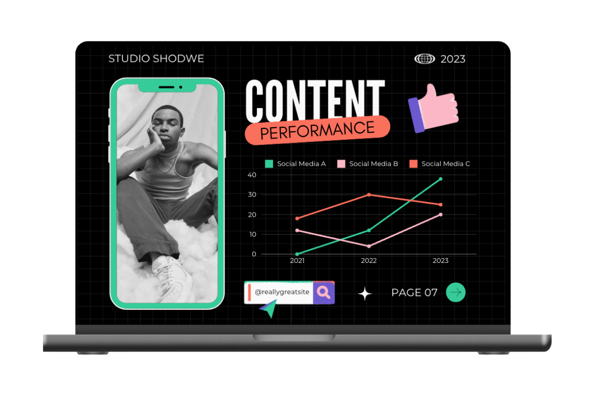 Social media presentation template
A social media presentation is a strategic visual communication tool that explores social media topics. Social media presentations are typically created for these purposes:
- Reporting: Monthly recaps, year-end results, campaign post-mortems, etc. made to analyze results, prove success, and determine next steps
- Strategy: Explorations of brand-level, channel-level, or campaign-level strategies, tactics, and plans made to educate or achieve buy-in
- Pitching: Overviews and highlights of services made to win over new customers; typically created by agencies for potential clients
The essence of a social media presentation lies in its ability to cut through the clutter and transform information into an engaging and accessible format that maximizes audience engagement.
How to create a social media presentation
One does not simply make a slideshow.
Sure, you could just open up your presentation template and start dropping random thoughts, data points, and images onto the page. But it’s guaranteed you’ll spend longer getting your deck to 100% when you do it this way. A great social media presentation comes together quickly if you do a bit of legwork before ever opening your template.
Step 1: Research and planning
Laying a solid foundation through research and planning is crucial. Here's how to kick off your process.
1. Define your objectives
Start by outlining the goals of your presentation. What do you want to achieve? There are three basic purposes for creating a presentation:
- Persuade stakeholders
- Showcase success
- Educate your audience
A good social media presentation will have elements of all of these built in. But it’s important to define your main objective so you can develop the bulk of your content around this goal.
2. Know your audience
Think about who will be in your audience. Is it your boss or your boss’s boss? Is it your team? Is it a prospective new client? Tailor your content and examples to match their existing knowledge and expectations.
For example, it might be fine to include a funny meme as a way to relate to your team, but company leadership might not be as charmed by random bits of humor. Likewise, it’s better to err on the side of professionalism when you’re sending a proposal to a potential client you don’t know very well.
3. Gather relevant data
If you’re making any claim — whether it’s about campaign performance or your track record with clients — people want to see evidence that backs it up. Collect data that supports your key points. It might be metrics from social media platforms, audience demographics, or campaign performance. Having solid data strengthens your presentation's credibility.
4. Craft a compelling story
Your presentation should tell a story. Structure it with a clear beginning, middle, and end.
In a reporting focused presentation, that might look like introducing the problem or challenge, highlighting the actions taken, revealing the resolution, and concluding with the positive results.
In a proposal deck, the beginning might be an introduction and high-level metrics, the middle might be a specific case study that applies to the client, and the end might be a summary of the proposed solution.
This narrative style approach captivates your audience and makes your information more memorable.
5. Create an outline
It helps to brain dump everything you want to talk about in a presentation. Then use your beginning, middle, and end to organize your content logically. Develop a clear outline that flows seamlessly. This will serve as your roadmap as you move forward, ensuring a structured and coherent presentation.
Step 2: Designing your social media presentation
Once you develop your content it’s time to drop it into the presentation, right? Not so fast! You’ll save yourself a headache later if your next step is design. Rather than inputting all your content and then applying your visual theme, you can create a visual theme first and apply it automatically.
Here’s what to think about when designing your presentation.
Visual theme
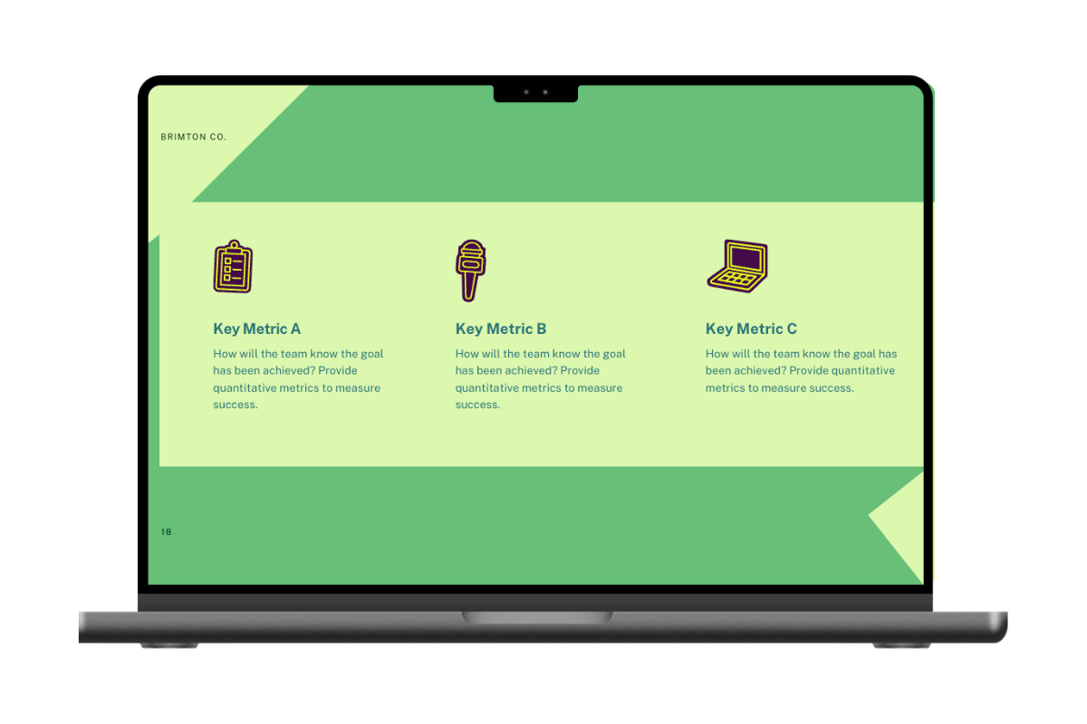
Sample social media presentation
Use the same colors, fonts, and design style throughout to keep your presentation looking clean and professional, and helps viewers understand the information hierarchy. Pay particular attention to the color, size, and weight of titles and headers, as these visual cues help the viewer follow the flow of information.
Some presentation platforms, like Google Slides and PowerPoint, let you create a custom theme that you can easily apply to every slide. Then you don’t have to manually adjust font sizes, spacing, and colors, saving a ton of time you don’t realize you’re wasting.
Images and data visualizations
Add pictures, graphs, and charts to add meaning to information and break up the text. Pictures grab attention and make your info easier to understand and remember.
Conventional wisdom says to include a picture on every slide. That’s probably overkill. The amount and type of imagery you use depends on the type of presentation.
- A reporting deck will need several data visualizations in the form of graphs and charts. Screenshots from your social accounts are also a great way to show your content strategy in action, and call attention to audience engagement moments.
- Strategy decks can use data visualizations too, but you’ll also want to illustrate ideas with conceptual visualization. This includes tables, venn diagrams, flowcharts, and infographics.
- Proposal or pitch decks benefit from charts and graphs, and you’ll want to include plenty of examples of your work. It’s probably a good idea to use photos of your team to humanize your brand.
Use of brand elements
Add your branding. It makes your presentation look polished and ties it back to your brand. This builds trust and makes you look professional. If you’re working on an internal presentation, there might be a template presentation that has all of this built in. If that’s not the case, go the extra mile to adopt your company’s branding into your theme.
Accessibility considerations
Ensure everyone can see and understand what’s being presented. Use clear fonts and enough color contrast, and avoid overly complex visualizations. Design for these considerations, and your presentation will reach the most diverse audience:
- Make sure text and other elements are big enough: Consider how a presentation will be displayed. If you’re casting to a large room, make sure the text is big enough for the audience in the back of the room to see.
- Use legible fonts: Stick to simple serif or sans-serif fonts, especially for body text. If a cursive font is part of your branding, limit its use to titles.
- Check the color contrast: Low contrast makes things hard to read or distinguish, especially for people with low vision. Use a color contrast checker if you're not sure whether text is legible.
- Add captions to charts and graphs: Don’t make people decipher charts and graphs on their own. Help them along with clearly labeled titles, axes, and captions that briefly explain the results.
- Define acronyms: This depends on your audience, but it’s always important to define acronyms upfront, especially if you use them often.
Keep it simple
Don't cram in too many visual elements. Focus on the most essential info, and use white space (empty areas) to keep things clean. This helps people focus on what matters.
The KISS (keep it simple, silly) principle is especially important when you start to add text. Consider whether people will be viewing your presentation in person, viewing it over a video call, or reading it on their own device. If a presentation is created as a reference material that someone will read at their own pace, it can contain more text.
But if its primary purpose is a visual aid while you’re presenting, you’ll want people to be focused on your words. This means less text on the page. In this case, it’s best practice to include your talking points in the speaker notes so that afterwards you can circulate the presentation without having to add more information.
Step 3: Structuring your social media presentation
With your content and design ready, let's organize your presentation for the best impact.
Introduction
Capture your audience's attention early on. Is it a compelling story, a surprising statistic, a thought-provoking question, or impressive KPIs? Find your hook to get them intrigued and invested from the start.
The typical social media presentation usually isn’t a place for TED Talk-style intros that share a childhood memory. At the same time, diving right into a sales pitch or a table of data points is jarring. Ease people into the presentation by not only providing context for what they’re about to learn, but also getting them intrigued about what’s coming.
Logical flow
Arrange your content in a way that makes sense. Connect your points so people can easily follow what you're saying.
As you start to create slides, ask yourself “what does someone need to know in order to understand this slide?” That’s an indication of what content needs to come before it. Then ask, “what questions will they have once they learn this information?” That’s an indication of what comes next.
Be wary of over-explaining, though. Having too many slides that go into too much detail defeats the condensed, overview nature of a presentation. Explain just enough, and leave room for questions and conversations.
For example, in a reporting presentation you might want to show historical data for context, but you won’t have enough room to describe how every metric has shifted month-over-month. An appendix works wonders in this case. Simply include additional charts and graphs in the back end of a deck. It’s there for reference, but it won’t be presented in person. You can even use this template over and over and keep moving last month’s slides to the appendix so there is a log of info.
Storytelling techniques
Even the most data-driven decks can benefit from a storytelling approach. Every story follows a very basic progression: exposition, problem, resolution. You can model your content in the same way.
If you’re creating a strategy deck meant to persuade stakeholders to get on board, your story might look like:
- Exposition: What the current landscape is
- Problem: Why the current way is not working
- Resolution: What we can do differently to make things work better
A data reporting deck meant to showcase success could look like:
- Exposition: What does the historical data show?
- Problem: What goal are we still trying to reach?
- Resolution: Did we reach the goal, and how?
If you’re creating a proposal deck, the story progression might look like this:
- Exposition: Introduce your team and your expertise
- Problem: Describe your target customer’s problem
- Resolution: Show how you can tackle this problem via a case study
Tell a story with your info. Share the problem, what you did about it, how it turned out, and end with positive results. Stories stick better in people's minds than raw data. This beginning, middle, end approach will keep your deck flowing smoothly instead of jumping around between concepts.
Information hierarchy
Remember that a presentation is a visual aid. The way you structure information visually is crucial.
Basic hierarchy and text styling helps to highlight the important stuff. Think bold text, bullet points, and visuals to guide people's attention to critical points. Then there’s more advanced visual aids, like flowcharts, tables, and maps. Presentation software often has tools for making these built in.
Conclusion
Conclusion slides are often the last ones you make, and you might be exhausted by the time you get there. But don’t sleep on this section. This isn’t just your chance to summarize your main point — it’s also your call to action. End strong by letting the audience know what comes next and how they can play a role in it.
Step 4: Adding interactive elements
Now the final touch. Let's make your presentation more engaging. Choose a few of these elements to include. You don’t need to use all of them. Again, consider your audience and what would be most significant given the context.
- Live polls and surveys: Add polls or surveys to get instant feedback. This makes your presentation more interactive and gives valuable insights into people's thoughts.
- Multimedia integration: Embed videos or live demos to spice things up. These elements keep people interested and go a long way in reinforcing your main points.
- Interactive infographics: Use interactive infographics to explain complicated data in a fun way. Let people explore info at their own pace for better understanding.
- Q&A sessions: Make time for questions. Encourage people to ask and answer thoughtfully. This keeps them involved and clears up any confusion.
These interactive elements keep your audience interested and make a lively and unforgettable social media presentation. Remember to tweak these elements based on your audience and presentation goals.
Social media presentation examples
Need some inspiration? Here are four examples to get your creativity flowing.
1. Reporting on social media campaigns
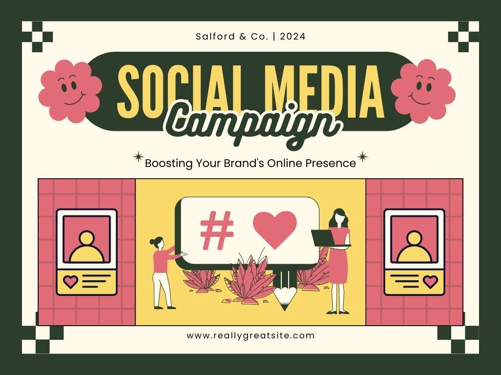 Here’s a social media campaign presentation with a retro look. This template is one of the more robust and detailed on Canva for social media presentations. With slides on campaign objectives, content creation, calendars, and more, it has everything you need to teach about or pitch your campaign.
2. Sharing the phases of a social media strategy
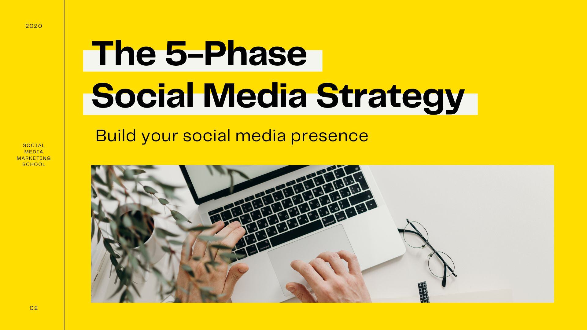 Canva again comes through with this bright and clean presentation. This deck highlights the difference between social media marketing and traditional marketing. It walks through five phases to build a full-fledged social media strategy, including metrics to track.
3. Social media proposal
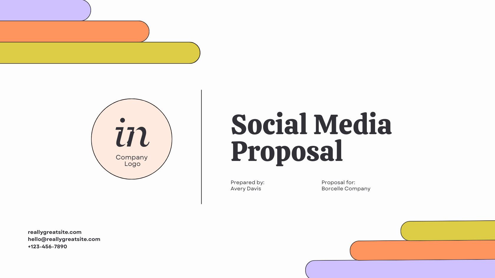
What this proposal deck template does well is capturing the essentials, including introducing the team, showing past work, and leaving room for a client pitch. It’s a minimalist design that will translate to a simple, no-frills proposal that you can make your own.
How to crush your social media presentation
Finally, it’s go time. Your content is ready, your design is polished, and your slides are set up. Let’s guarantee your delivery hits the mark.
Here's how to make a lasting impression and excel during your social media presentation:
Master your delivery
Before stepping into the spotlight, be intimately familiar with your content. Understand the data, key points, and the story you're telling. This knowledge will boost your confidence and help you stay on your toes during the presentation.
Rehearse your presentation over and over again. Practice in front of a mirror, with friends or colleagues, or record yourself. This helps refine your delivery and ensures you can smoothly navigate your slides.
Engage your audience
Maintain eye contact, speak clearly, and vary your tone. Encourage interaction through questions or discussion points. Engagement keeps your audience attentive and enhances the impact of your message.
A part of engaging your audience is sticking to your allotted time frame. Practice pacing to ensure you cover all points without rushing or dragging. A well-timed presentation reflects professionalism and consideration. It will help keep your audience engaged throughout your time.
Use specific data
Tracking social metrics is a vital part of social media management. Tracking basic metrics like page views, impressions, post likes, etc., are important. But to fully understand if you’re getting the best return on investment, you’ll need to go deeper.
Metrics like click-through rate, cost-per-click, and referral traffic help you understand follower behavior. By assessing the effectiveness of social media investments, you’ll maximize returns and tailor strategies to your client’s audience, ultimately influencing the profitability and success of their digital efforts. Here are 21 social media metrics to track and why.
Incorporate storytelling techniques
You’ve heard the phrase, “Data tells, but stories sell,” right? Don't just present data—share stories. Weave narratives around your key points. Stories connect with emotions, making your message more memorable and relatable.
Leverage visuals effectively
While presenting, use visual aids strategically. We’ve talked about this at length throughout this guide. Point to key data on charts, emphasize visuals, and refer to slides as needed. Visual aids enhance understanding and reinforce your spoken points.
When it comes to text in presentations, less is more. For visuals? Always more. Why? Visuals go directly into long-term memory, unlike words. You can’t argue with science.
Prepare for questions and challenges
Be ready for questions and answer them with confidence. You may even get pushback — and that’s OK. It means your audience is engaged. If you don't know the answer, admit it, and offer to follow up later. Handling questions gracefully enhances your credibility.
Wrapping it up
Mastering the art of delivering a captivating social media presentation is essential for effectively conveying the impact of digital efforts.
From defining objectives and understanding your audience to choosing the right platform and incorporating interactive elements, this step-by-step guide provides you with the tools and skills to create memorable presentations.


